Well, if you’re a designer, web developer, you must be aware of rem units. In this post we will go through the basics and learn how to use it. First, lets go through the little basics for those who are not aware of the “rem” unit.
As per the specs, we have two kind of Distance Units or the Length type:
- First one is Absolute lengths, i.e.: the ‘cm’, ‘mm’, ‘in’, ‘pt’, ‘pc’, ‘px’ units
- Second one is Relative lengths having two sub categories:
- Font-Relative lengths: “em”,”ex”,”ch”,”rem” units &
- Viewport-percentage lengths: the ‘vw’, ‘vh’, ‘vmin’, ‘vmax’ units
For example, observe this CSS rule:
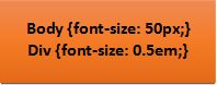
It specifies that every element in the body will have a font-size of 50 pixels and Div element will have a font-size of 0.5em, means half of its parent. So, let’s see how it affects your styling in below example:
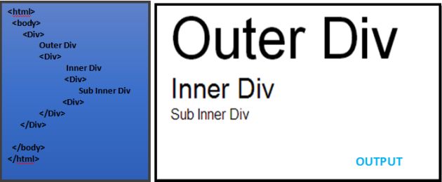
You can see here, that every inside div is inheriting the font-size length from its parent div. Here pixels (“px”) is an absolute length unit whereas “em” is relative. To mitigate this problem – Rem unit has been introduced.
The “rem” unit is for “root em”. What “em” unit does is, it inherits the length from its immediate parent element and then scale it on the given ratio. This one is not relative to its parent but to the root.
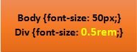
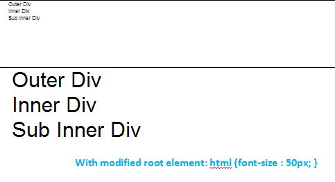
If you just replace the em to rem in sample CSS rule above and see the change in Output:
OUTPUT:
Scaling document elements
You can use rem to scale some elements in a document while leaving others in place. It provides a way to specify lengths as fractions of the root element’s font size. In practical terms, this almost always means the font size of the element. The most obvious use for rem is replacing em to protect inner element font sizes from being changed by outer elements, thus avoiding the classic nested em scaling problem. Let’s look at how rem works and how it differs from the em unit. An em value is calculated against the font-size of a current element, so boxessized with it will consequently scale as font sizes are adjusted by the element or its ancestors. Meanwhile, rem is defined as the font-size of the root element. So, all references to rem will return the same value, regardless of ancestor font size. In effect, rem is a document-wide CSS variable.
Q. Why should you bother?
A. Well, let’s say you want to enlarge everything on your site as soon as it exceeds a certain width limit. With everything rem you just set the font-size of the tag to 120% and, magic, everything is 20% bigger. But what to do with everything px in this case? Good luck with that! Make a media query and overwrite every single element that is supposed to be larger? No way!
Also, it’s a much better option than “zoom”ing as zooming isn’t as easy as it looks. By increasing the single “root em” font-size, all our elastic pixels increase!
Hope you find this post useful. Thanks for reading 🙂